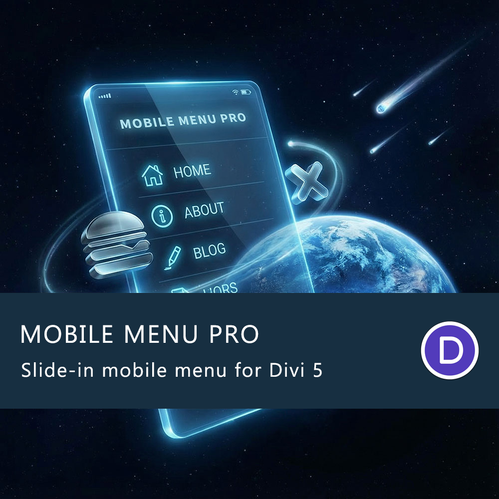
Mobile Menu Pro for Divi 5 – Developer license
149,00 $
Mobile Menu Pro v3.0.89
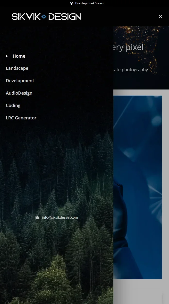
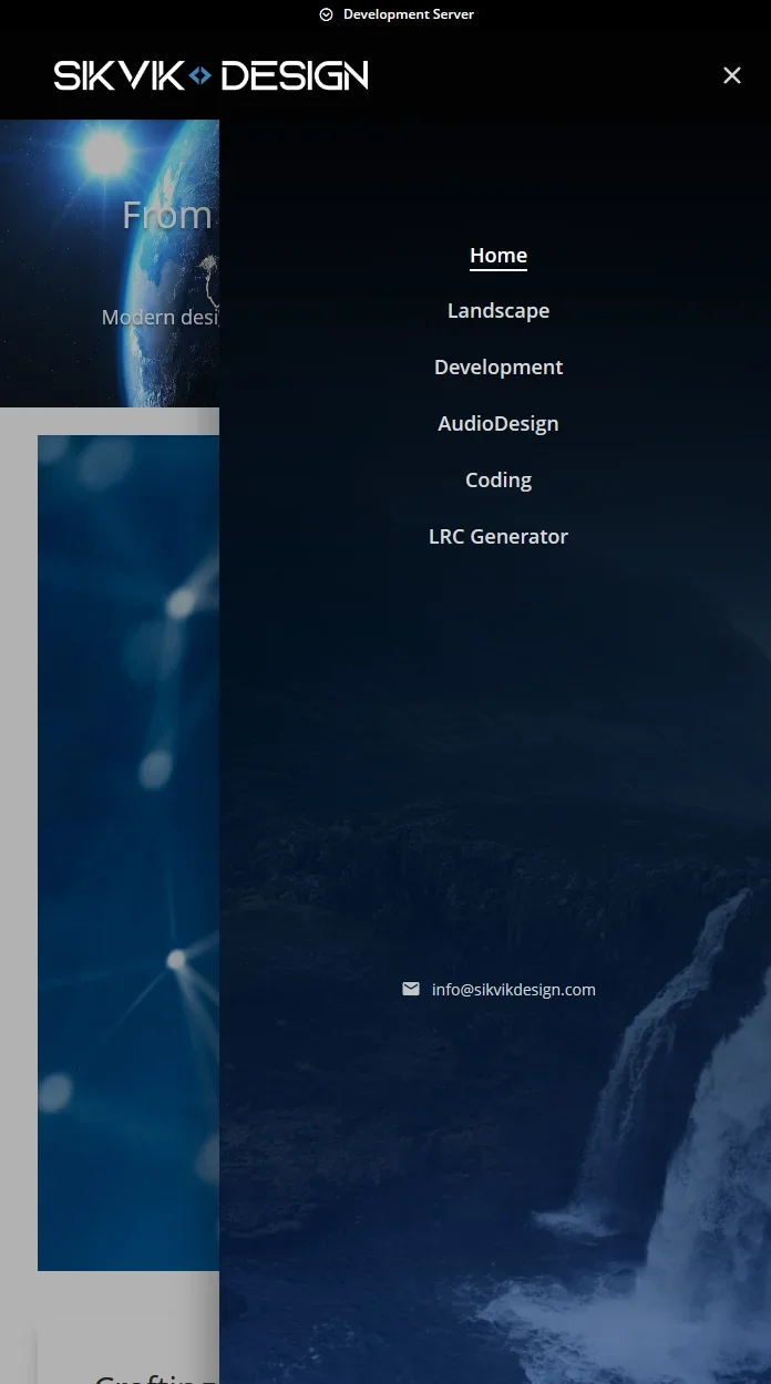
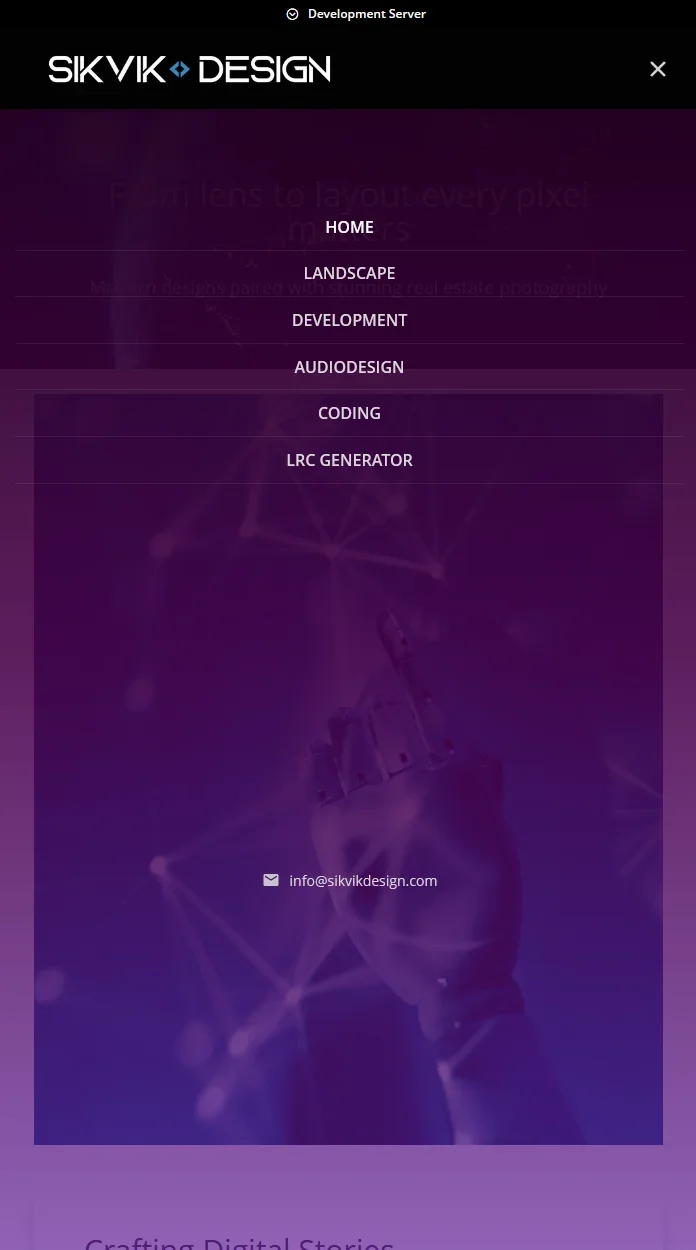
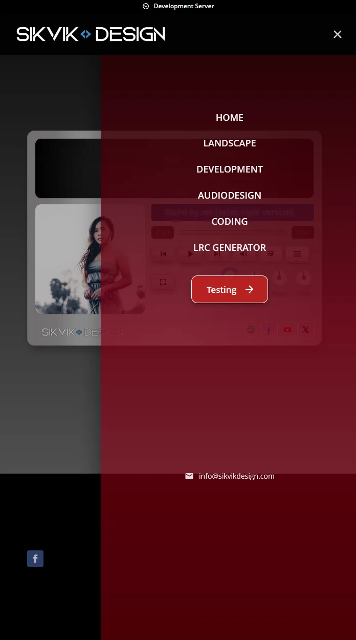
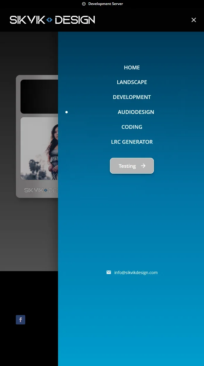
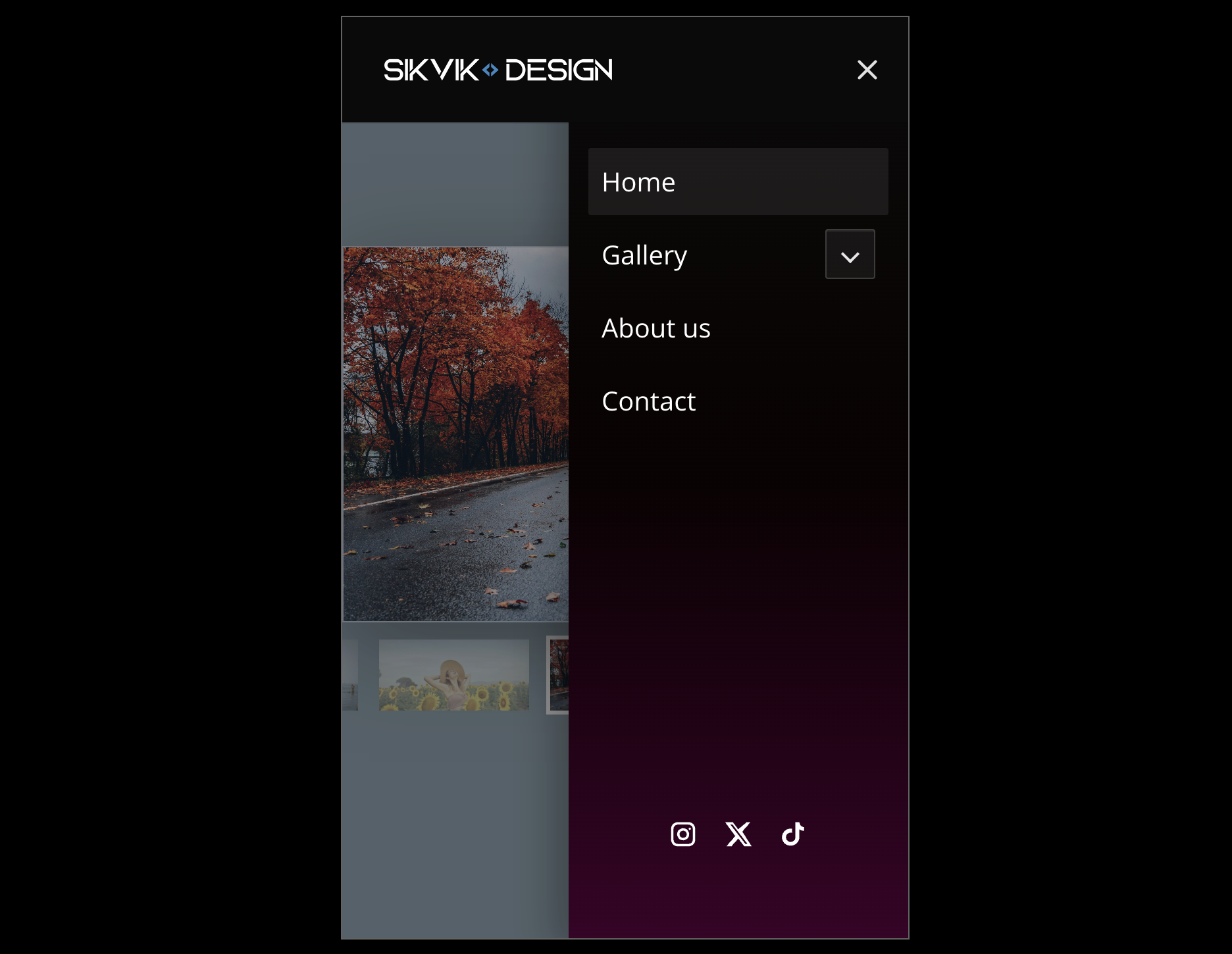
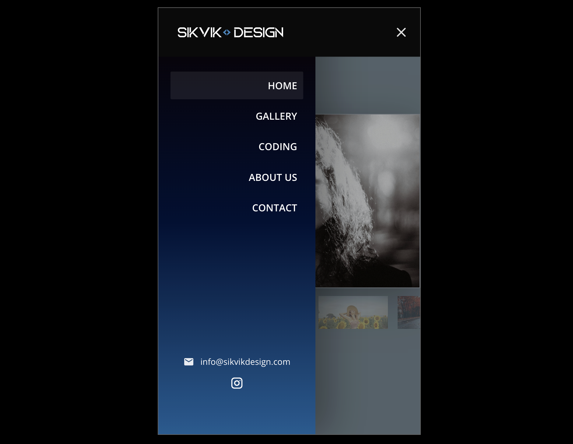
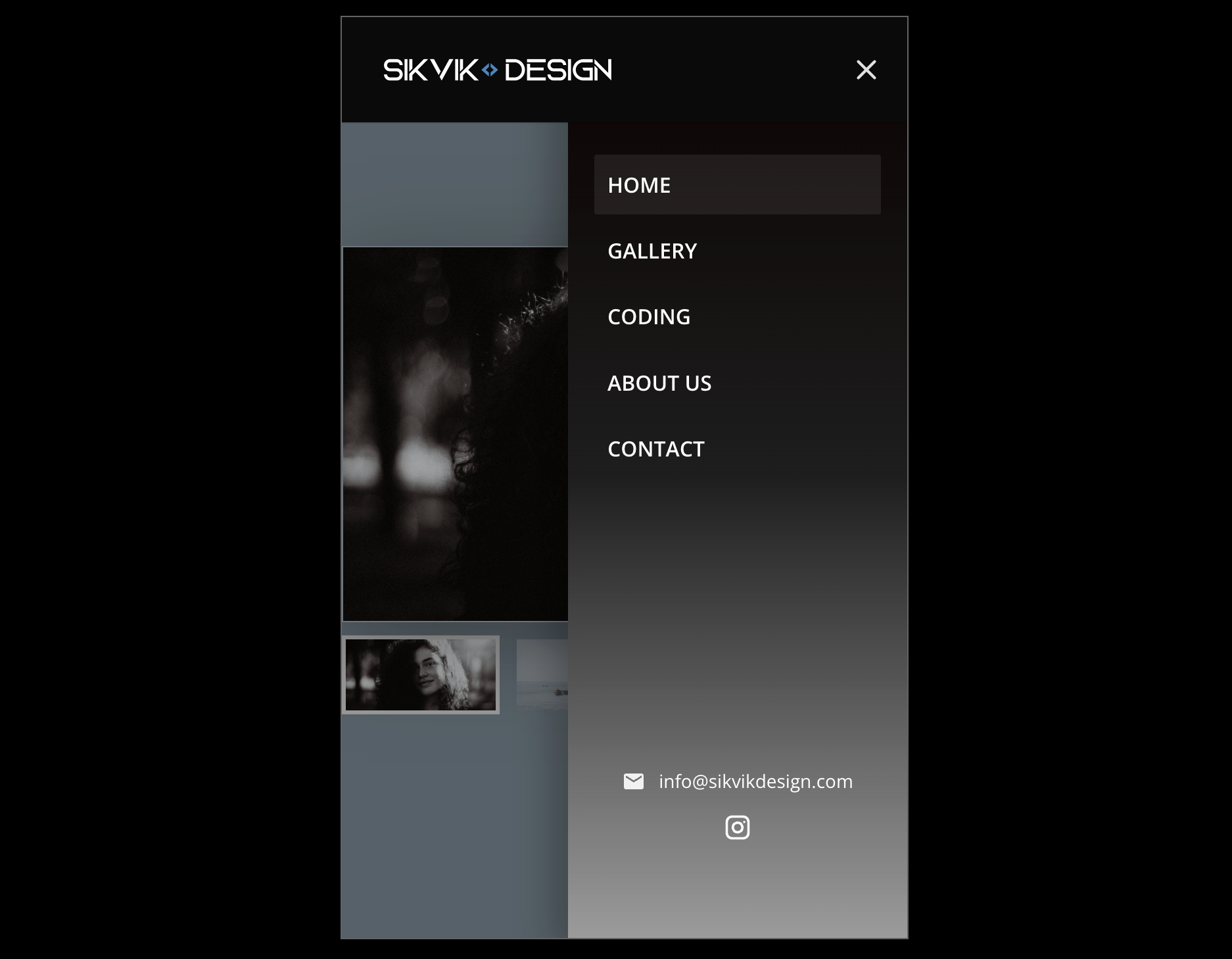
for Divi 5 replaces the default mobile dropdown with a sleek slide-in panel that feels like a modern app drawer.
The goal is simple: a cleaner mobile navigation experience, better control over design, and settings that are easy to manage — without heavy scripts or messy custom code. Built specifically for Divi 5, the plugin reads your existing WordPress menu and displays it inside a dedicated off-canvas panel on mobile. You keep your current menu structure (including submenus), while gaining full control over spacing, colors, hover styles, and behavior.
What you get
- Modern slide-in mobile menu panel
- Customizable CTA Button
- Submenus supported
- Optional floating hamburger after distance scroll
- iPhone-friendly close handling
- Clean, organized settings UI (easy to tweak)
- Works with default Divi 5 menu header and global header
- Export & Import your current Mobile Menu Pro settings to a JSON
- One-time purchase. 100 activations — perfect for developers.
Behavior toggles
- Menu under header mode (shows hamburger animation)
- Option to hide the internal close X icon
- Hamburger animations toggle
- Toggle uppercase menu links
- Toggle hide menu dividers
- WooCommerce cart toggle
- Slide in menu from the left, right, top, bottom and fade-in + zoom-in
You can download 4 example presets below.
Only logged in customers who have purchased this product may leave a review.
Youtube video below
Design & styling controls
-
Panel background as solid color or 3-color gradient
- Customizable CTA Button
- Support image background
-
Overlay color + opacity
- Optional floating hamburger after distance scroll
- Link typography controls (size, weight)
-
Hover styles (background, underline, or color only)
-
Divider styling + option to hide dividers
-
Menu item border radius and menu alignment (left/center/right)
-
Panel width supports % / px / vw
-
Practical layout sliders (padding, menu top spacing, header width on mobile)
-
Custom CSS field for advanced fine-tuning
- Export and import mobile menu preset
- Optional WooCommerce cart in mobile menu
- Social links in mobile menu
- 6 different hamburger animation styles
- Inherit global header font toggle
- Email and Phone info in mobile menu
If you want a mobile navigation that looks professional out of the box — Mobile Menu Pro for Divi 5
Key features list
-
Slide in mobile menu panel for Divi 5
-
Slide in menu from the left, right, top, bottom and fade-in + zoom-in
-
Built-in "click outside the menu" to close menu
-
Submenus supported (no broken hierarchy)
-
iPhone close-button reliability improvements
-
Solid or 3-color gradient panel background
-
Panel width in % / px / vw
-
Menu alignment: left / center / right
-
Hover styles, typography, dividers, border radius
-
Custom CSS field for advanced tweaks
Perfect for: agencies, freelancers, and site owners who want a polished mobile menu without redesigning the entire header — and without patchwork scripts.
Licensing
-
One-time purchase. No subscription. 100 activations — perfect for developers.
-
Download the plugin ZIP instantly after checkout (and anytime later from your account).
- If there is an update you can always download it from your login.
Updates & Support
-
Includes all updates.
What support covers
- Does not include custom development, custom styling beyond basic guidance, or third-party theme/plugin conflicts outside reasonable investigation.
Reviews
There are no reviews yet.
Only logged in customers who have purchased this product may leave a review.
Mobile Menu Pro for Divi 5 *update*
Mobile Menu Pro for Divi 5 just keeps getting better — and the latest updates are all about more control, cleaner design, and faster UX.
We’ve added a built-in CTA Button so you can place a clear “Book Now / Contact / Get a Quote” action right inside the mobile panel, styled to match your brand. On top of that, we upgraded the settings UI with Alpha Color Pickers, so you can finally use true transparency (RGBA) across your menu design — perfect for modern overlays, glassy panels, and subtle hover effects.
And for speed + convenience, the new Floating Hamburger option keeps your menu trigger accessible even when users scroll — giving you that “always available” navigation feel without sacrificing design.
Reviews